Often when developing a new logo for someone, I am asked to work with an existing design. Usually it is an element that is specific to their industry. For example, the ViLink Logo pictured to the right has what looks like vertical and horizontal branches in it. ViLink  works with high-end custom database development. The branches actually represent the "many to many" relationship in a database schema. More than likely, if you weren't into database design and development, you would just assume it was an abstract rendering that the customer liked. Not so, many logos have a hidden meaning, the trick is knowing what it is and how to
see it.
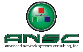
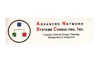
A similar request was made with the logo for ANSC, Inc. ANSC specializes in Network design, planning and management. In their industry, one of the "icons" used is the red-green-blue schematic with boxes. I was asked to incorporate that particular graphic device in their new logo. You can see the before and after, by clicking on the up/down arrow to the left of the new ANSC logo. To visit their website and see what and how they do it, go to http://www.ansc-inc.com. They are good people and will take good care of you.
As we have seen, logos can begin with sketches as seen in our first Anatomy of a Logo, or they can simply begin with the client requesting specific graphic elements. Either way, the challenge is to create something fresh and vibrant...once again, not at all from nothing, but from a specific something.